The Consequences of Color
October 11th, 2017
I find the importance of color selection, specifically, as it pertains to brand identity, to be one of the most interesting and complex facets of graphic design. Like me, you may have assumed it to be a choice as simple as declaring “I like blue”. But there’s more than meets the eye.
So, I read some studies* – yes, it was painful, but the key takeaways were very insightful. For example, one reported up to 90% of snap judgements about a brand are made based on color alone. Another stated that predicting consumer reaction to color appropriateness is more important than the color itself. Finally, another concluded that it is important to create differentiation from your direct competitors through the use of color. Hmmm…
It’s not gravity, but it’s heavy.
Scientists have studied the effects of color for years. In the 1660s, Sir Isaac Newton began experimenting with sunlight and prisms, establishing the visible spectrum of the colors we see in a rainbow. His work led to a bunch of crucial breakthroughs from optics, chemistry, perception and the study of color in nature. Thanks to involuntary primitive responses, the ways that humans react to color appear to be endless. Why do you think a stop sign is red?
Blue is blue? Not so fast...
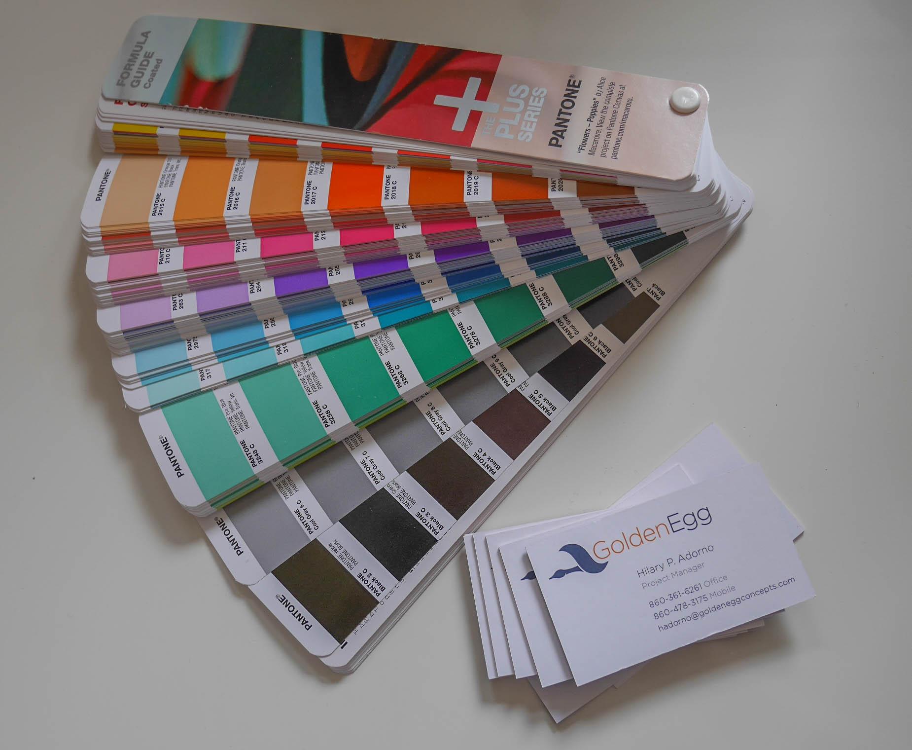
Designing or updating your company logo? Before you settle on an ideal color palette, you might want to consider the various applications – both print and digital. For starters, do you know the difference between RBG, CMYK and Pantone colors?
RGB is a simply acronym for Red, Green and Blue – the three essential colors required to display color digitally (think computers, digital cameras, televisions, mobile devices, etc.). RGB colors are projected against a screen using light. Since all devices using RGB are not calibrated the same way, some colors can display drastically different than you’d expect them to. Imagine walking into Best Buy towards the huge wall of TV screens, all projecting slightly different colors of the same movie.
CMYK is a four-part color process used in printing (Cyan, Magenta, Yellow, Key (Black)). The reason black is considered “key” is because it is the color used in the key plate (printers know this… I don’t), creating the contrast and detail for the final image. Colors are printed in varying densities to create tonal difference. CMYK colors are mixed during the printing process, potentially creating slight inconsistencies in color throughout a printing run. Imagine your home or office printer – color is pulled from each color cartridge to result in the desired output. Things generally look pretty spot on – until you start dismissing those “Replace Toner” reminders.
Pantone colors are specifically mixed for each print run, and are recommended to ensure consistency and intent when accurate color communication is vital for your project. Imagine walking into Home Depot and asking that a can of Behr’s Planetary Silver paint be mixed up for you – that particular hue would be made by mixing a combination of other existing paint colors.
Color in Culture
If your brand has a worldwide audience, or if you care to think more broadly about color, I invite you to consider the following:
- In India, red represents wealth, power, fertility, and beauty. In South Africa, it is associated with sacrifice. In China red is worn to celebrate weddings and funerals. In the U.S., this highly visible color is associated with fire, danger, strength and power.
- In the U.S., yellow signifies cheer and warmth, but in France and Germany it signifies jealously, betrayal or weakness. In Africa and Latin America, yellow is the traditional color of mourning, whereas in Japan it represents bravery and wealth.
- In the Middle East, blue protects against evil. In the U.S., it inspires calm, trust and confidence. It has feminine connotations in China. In Judaism and Hinduism, it can represent holiness, divinity or wealth.
- Green is perhaps the most confused color in the spectrum. In the West, it represents money, naivety, greed and environmental awareness. In the East, it is associated with fertility, youth and health… but don’t wear a green hat in in China because it implies your wife is cheating on you (honestly… I didn’t make this up).
- In many cultures, purple represents nobility or wealth because this color dye was extremely rare and expensive. Conversely, it is a color commonly associated with death. Flying in the face of all that seriousness, most little girls in the U.S. want their rooms painted purple.
- In India, orange is considered sacred. In Japan, it symbolizes love. Egyptians wear orange to mourn. It many Western cultures, it is used to convey fun and creativity.
- Black is considered a masculine color in many cultures. It can also be associated with magic, superstition, or bad luck, and remains a color of choice for many luxury brands.
- In China, white is worn during times of mourning. It is also recognized as an international color of peace. I’m waving a white flag, are you?
At the end of the rainbow
So what does this mean to you? If you’re rebranding, the issue of color is nothing to scoff at. If you’re a new company, getting it right the first time is key because you’re establishing your brand identity and you need something both meaningful and impactful. In all cases, having professional input seems more valuable than ever, doesn’t it?